 New York City Council
Brand guidelines
As New York City Council continues to build its online presence, one challenge we are faced with is learning how to refine our identity and apply it cohesively to all of our work. This guide acts as a central location where we house a live inventory of brand guidelines, assets, UI components, code snippets, developer guidelines, and more. Anyone working with Council's online presence is encouraged to stay familiar with this guide and help ensure that it's kept up-to-date.
1. Wordmark
Seal + type lock-up
The seal + type lock-up is Council's primary brand identifier and should be the default wordmark for all communications, except in special circumstances. Consistent application of the wordmark reinforces brand recognition and trust. For these reasons, always display the wordmark as specified here.
- The type is set in Georgia Regular
- The seal appears to the left of the type
- The seal's height is equal to twice the font size
- The seal and type are center-aligned with each other vertically
- The space between the seal and type is equal to 1/2 the font size
- The clearspace is equal to the font size
- The seal's 1.1:1 ratio is intentional and representative of Paul Manship's original design.
An em is a relative unit, equal to the specified font size—e.g. 1em in a 16-point typeface is 16 points.
2em0.5emNew York City Council1em1em1em
Observe clear space around the wordmark to optimize its visual impact and reinforce brand recognition. No other elements (e.g. text, graphics, photos) should appear in the clear space—with the exception of videos or photos over which the wordmark is overlaid.
Overlaid wordmark
When the Council wordmark is overlaid on a non-white background, a white wordmark should be used. For videos or photos, the wordmark should appear over a box with a background of rgba(0,0,0,.1), or pure black at 50 percent opacity. Videos and photos must not interfere with the wordmark's legibility, and the wordmark must not obstruct key elements of images.
 New York City Council
2. Color palette
Primary colors
Color is an important aspect of Council's brand identity. Using color appropriately is one of the easiest ways to make sure our materials are cohesive. Our primary color palette includes a specific NYC Council blue, an dark blue, and shades of gray from black to white.
The dark blue should be used sparingly. It's meant to accent the NYCC blue, such as when links darken when they are hovered.
Secondary colors
The primary color palette is intentionally limited. But not everything can be accomplished with only blue and shades of gray. Our secondary color palette includes seven colors that span the range of the color spectrum. These additional colors are useful in data visualizations, social media graphics, and videos.
NOTE: * denotes that this color passes WCAG 2.0 AA guidelines for color contrast up to the MEDIUM color, while all other colors are compatible with WHITE, OFF-WHITE and LIGHT as the background color.
Accessible colors
For those with low vision, typographic contrast is important. In accordance with Web Content Accessibility Guidelines (WCAG) 2.0 requirements, please use the Color Contrast Checker to make sure that all text and background color combinations pass AA contrast requirements.
- Don't set light type on light backgrounds
- Don't set dark type on dark backgrounds
- Avoid relying purely on color for visual cues
3. Typography
Typefaces
Council's primary typeface is Open Sans—a humanist sans serif typeface with an upright stress, open forms and a neutral, yet friendly appearance. It's optimized for print, web, and mobile interfaces.
Specimen
Open Sans
Styles
Regular
Regular Italic
Bold
Bold Italic
Characters
ABCĆČDĐEFGHIJKLMNOPQRSŠTUVWXYZŽabcčćdđefghijklmnopqrsštuvwxyzžАБВГҐДЂЕЁЄЖЗЅИІЇЙЈКЛЉМНЊОПРСТЋУЎФХЦЧЏШЩЪЫЬЭЮЯабвгґдђеёєжзѕиіїйјклљмнњопрстћуўфхцчџшщъыьэюяΑΒΓΔΕΖΗΘΙΚΛΜΝΞΟΠΡΣΤΥΦΧΨΩαβγδεζηθικλμνξοπρστυφχψωάΆέΈέΉίϊΐΊόΌύΰϋΎΫΏĂÂÊÔƠƯăâêôơư1234567890‘?'"!"(%)[#]{@}/&<-+÷×=>®©$€£¥¢:;,.*
For headings, Council uses Georgia—a serif typeface that appears elegant but remains legible at small and large sizes, when printed or on various screen resolutions.
While the italic variant of Georgia might sometimes be necessary for emphasis, its roman variant is preferred. However, its bold weight should never be used.
Specimen
Georgia
Styles
Regular
Regular Italic
Bold
Bold Italic
Characters
ABCĆČDĐEFGHIJKLMNOPQRSŠTUVWXYZŽabcčćdđefghijklmnopqrsštuvwxyzžАБВГҐДЂЕЁЄЖЗЅИІЇЙЈКЛЉМНЊОПРСТЋУЎФХЦЧЏШЩЪЫЬЭЮЯабвгґдђеёєжзѕиіїйјклљмнњопрстћуўфхцчџшщъыьэюяΑΒΓΔΕΖΗΘΙΚΛΜΝΞΟΠΡΣΤΥΦΧΨΩαβγδεζηθικλμνξοπρστυφχψωάΆέΈέΉίϊΐΊόΌύΰϋΎΫΏĂÂÊÔƠƯăâêôơư1234567890‘?'"!"(%)[#]{@}/&<-+÷×=>®©$€£¥¢:;,.*
Font Size
The typographic scale consists of nine different font sizes. Although web fonts are sized in relative rem units, pixels are listed here for visual reference.
The quick brown fox…45px
The quick brown fox jumps…36px
The quick brown fox jumps over the…28px
The quick brown fox jumps over the lazy…24px
The quick brown fox jumps over the lazy dog. 21px
The quick brown fox jumps over the lazy dog. 19px
The quick brown fox jumps over the lazy dog. 16px
The quick brown fox jumps over the lazy dog. 13px
The quick brown fox jumps over the lazy dog. 11px
Line height
The spacing between consecutive lines of text has a similar impact on readability as measure. Too much, text appears fragmented. Too little, text is difficult to read. Suggested line heights are 1.6 for paragraphs small text and 1.2 for headings or large text.
Paragraph measure
A comfortable number of characters in each line of text is important for readability. If paragraphs are too wide, then scanning back to find the start of the next line can be awkward and the reader might miss or reread lines. Avoid setting paragraphs that are wider than 47em.
4. Icons
Font Awesome
Council uses the Font Awesome, an open-source set of 675 scalable vector icon which are easily styled with CSS.
Accessible icons
When using icons for pure decoration or visual styling, They do not need to be read when using assistive technologies. Add aria-hidden="true" to your markup so that these icons are not read.
<i class="fa fa-bicycle" aria-hidden="true"></i>When using icons to convey meaning (not decorative), ensure that the meaning is also conveyed to assistive technologies by including text with a sr-only class.
<i class="fa fa-warning" aria-hidden="true"></i><span class="sr-only">Warning!</span>NYC boroughs
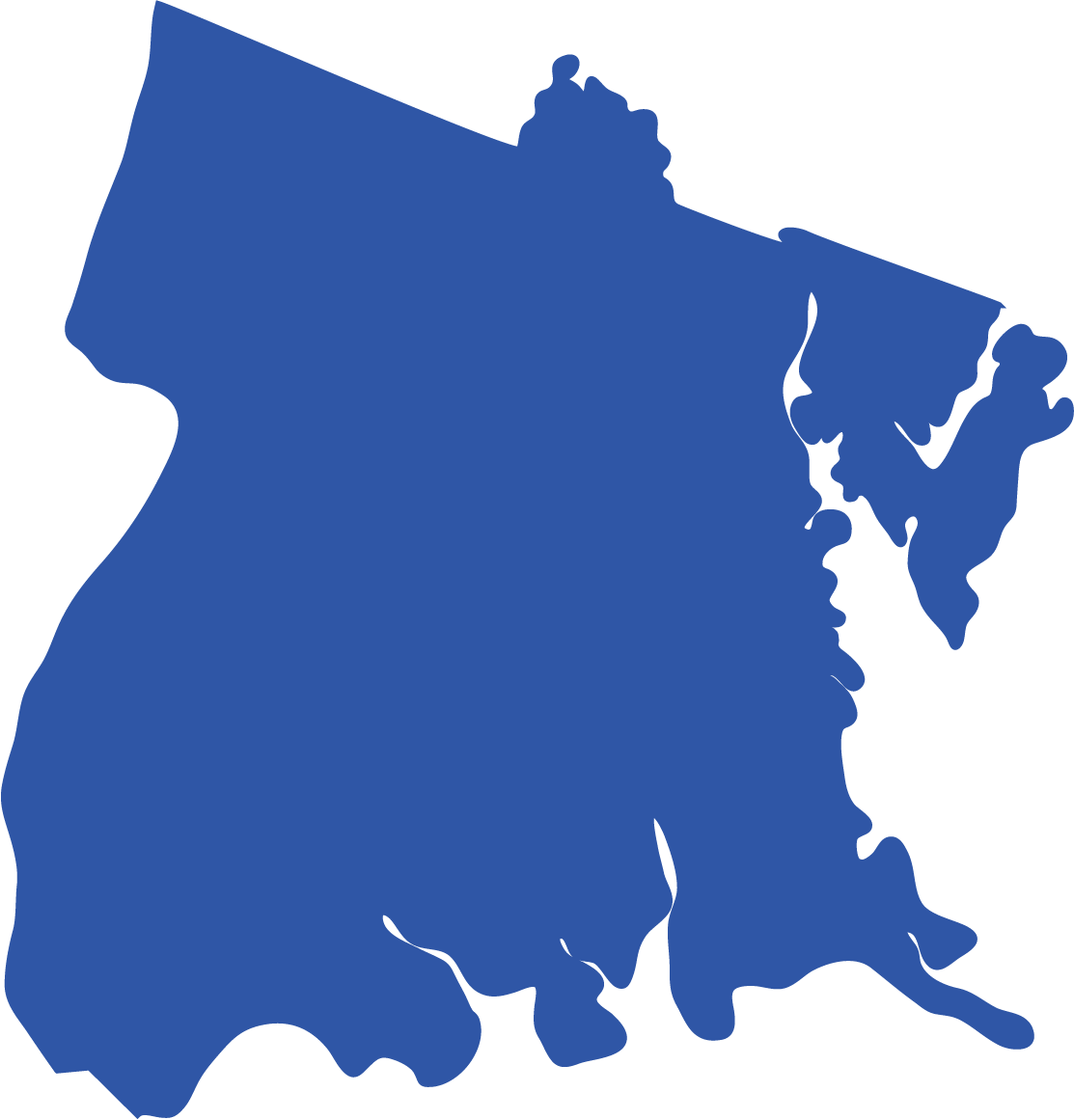
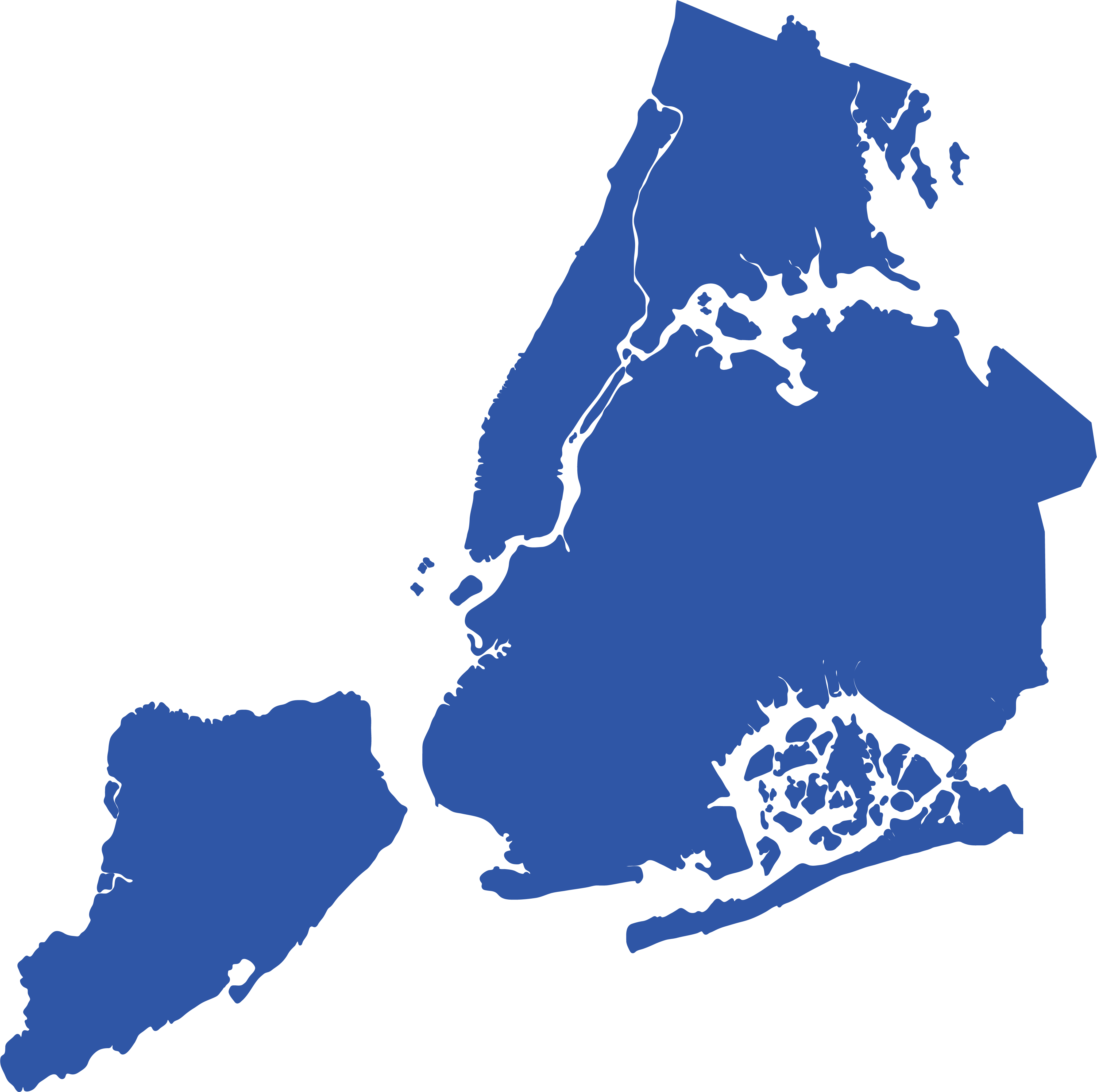
NYC Council developed NYC Borough images for Brooklyn, The Bronx, Manhattan, Queens, Staten Island, and NYC
 The Bronx
 Brooklyn
 Manhattan
 Queens
 Staten Island
 NYC
NYC
Accessible borough image
When using images they need to be read when using assistive technologies. Add alt="Brooklyn" or alt="Staten Island"to your markup so that these images are read.
5. Design effects
Boxes
Avoid putting content into lots of boxes. Instead, use whitespace to separate pieces of content and create visual hierarchy. For callouts, buttons, and other UI elements in boxes, make sure there's at least 1em of whitespace between the text and the edge of the box. When creating boxes, avoid rounded corners. Boxes should have squared corners.
Drop shadows
Drop shadows are used very sparingly and subtly. Do not apply drop shadows to content elements like buttons or text. Drop shadows should only be applied to the layout's primary containers. Shadows should not have any blur, they should retain sharp edges. The color of a shadow should be rgba(0,0,0,.1), or pure black at 10 percent opacity.
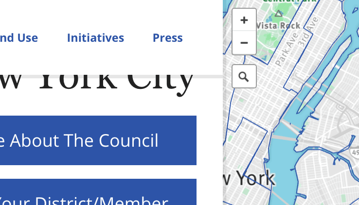
drop shadow applied to navigation and map
6. Media
Social media graphics
Council uses Canva to create social media graphics. Canva provides perfectly-sized templates for each social media site. When creating graphics, the most important thing is to keep it simple.
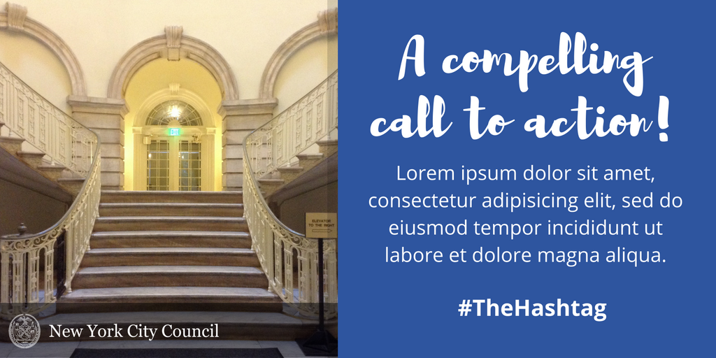
Use less text.
Don't allow the words to overpower the image. Avoid filling all available space with text.
Make only one point.
Consider the primary call-to-action. All text should strenghten that point. Avoid listing details and features. A good graphic might follow one of these formats:
- Offer a solution to a problem
- Show how to do something
- Encourage decision-making
- Tell a relatable or inspiring story
Choose meaningful images.
The image should reinforce your message. Don't use pictures for the sake of having a picture.
Use white space.
White space is essential in good design. It increases legibility and comprehension by almost 20 percent. Include plenty of margin around text, especially near the graphic's edges. Instead of making elements bigger, consider surrounding them with white space to create visual hierarchy and flow.
Use transparent overlays.
When text appears over an image, a black box with greater than 50 percent opacity should overlay the image. If a color other that black is used for the overlay, increase the box's opacity to make sure the text is easily readable.
Limit typography styles.
Avoid using more than three fonts. Choose fonts that are complementary. Avoid pairing fonts that are too similar.
Video
Make sure text is readable.
When displaying text in videos, make sure that it's reasonably large, uses high-contrast colours, and remains on screen for long enough to be read.
Provide subtitles.
The majority of Facebook video is watched without sound—as much as 85 percent. This also makes the vides accessibility for users with auditory disabilities.
The first three seconds are critical.
Facebook counts a view at three seconds. Video should be designed to capture attention within those first three seconds.
Disable autoplay. Specific sites like Facebook and YouTube play video automatically. When embedding video on the Council website, do not enable autoplay.
Avoid flickering content.
It's well-documented that flashing or strobing content can trigger epilepsy and migraines in susceptible individuals.
7. Language
Content that is clear, relevant, and reader-friendly helps provide a great user experience. Language that is concise and literal allows for more accurate automated translations and makes information more accessibile. Focus on simple and succinct sentences. Avoid governmental jargon and legalese.
Voice and style
Council aims to be clear and conversational, yet professional. To be as clear as possible, we strip sentences down to the actors and actions. The use of active voice is preferred to passive voice.
- Be conscious of the placement of the actors (or subjects) in their sentences. Write: the Speaker proposed changes instead of the changes were proposed by the Speaker.
- Be conscious of the use of the verb "to be." When the subject of your sentence comes after the verb, you are writing in passive voice.
- Avoid citations. If needed, integrate into text (e.g. according to the Department of City Planning).
- Alternate long and short sentences to help your writing flow better. Focus on one thought per sentence.
- Avoid repeating words in the same sentence to help with flow.
Acronyms and abbreviations
- Always spell out names of agencies and organizations on first reference, followed by the common abbreviation or acronym in parenthesis. On following references, the abbreviated agency name is preferred to the agency acronym. For instance, the Department of Parks & Recreation should be referred to on second reference as Parks, not DPR.
- Use the full state names, and never abbreviate state names: Austin, Texas; Milwaukee, Wisconsin.
- Use the gender-neutral Council Member. Do not abbreviate Council Member as CM.
- It's acceptable to use ampersands (&) and percent signs (%) in subheadings, charts, graphs, and web buttons. However, be consistent.
Addresses
- Always use numerals when writing out building numbers in addresses.
- In reference to specific street names, always spell out and capitalize words like Boulevard, Avenue, and Street. For street names that are also numbers, spell out and capitalize First through Ninth and use figures for 10th and higher (e.g Fifth Ave and 11th Ave).
- If a street name includes a cardinal direction, abbreviate North, South, East and West only when referring to a specific building (e.g. 326 W. 17th Street or East 34th Street).
Phone numbers
- Phone numbers use hyphens between groups of numbers (e.g. 212-123-4567). Do not use parentheses around area codes. Area codes and country codes get no special treatment and aren't preceded by a 1 or plus sign.
Capitalization
- Titles should always be capitalized when they appear before a person's name.
- Follow sentence case for web buttons that include three or more words. Use title case for buttons with only one or two words. Punctuating buttons are up to the discretion of the writer.
- Charter should always be capitalized when used in reference to the New York City Charter.
- Committee should always be capitalized when referring to specific committee (e.g. these committees, or the Land Use Committee).
- Council should always be capitalized when referencing the New York City Council.
- Council Member should always be capitalized, as two separate words, when referencing New York City Council Members. Also use the gender-neutral Council Member, not Councilman or Councilwoman.
- City should be capitalized when referring to New York City.
- District should be capitalized when referring to New York City Council Districts (e.g. the 11th Council District, or within several Districts).
- Speaker should always be capitalized when used in reference to the Speaker of the New York City Council.
- Mayor should always be capitalized when used in reference to the Mayor of New York City.
- Capitalize the first word of a subheading. Punctuating subheadings is acceptable for questions. Other forms of subhead punctuation are up to the discretion of the writer.
- Lowercase adjectives that describe status of a title (e.g. The former Speaker Christine Quinn).
Compositions
- Use quotation marks around titles of works of art and compositions, like books, songs, television shows, video games, and poems. Do not use quotations or italics for names of publications (e.g. "The Grapes of Wrath," or The New York Times).
Contractions
- Use common contractions like isn't, won't, and you'll when possible. This sets a more conversational tone.
Names
- Always use a person's title, first and last name upon first reference. Use title and last name for following references. Do not use courtesy titles, unless needed to differentiate between people who have the same last name.
- On first reference, link Council Member names or Districts to the appropriate Council District page.
Numbers
- Spell out numbers one through nine. Use numerals for numbers 10 and greater. Always spell out numbers that begin sentences, unless it's a year (e.g. 2006 was a great year). For numbers in the millions, billions or trillions, use a number and word (e.g. 1 billion, 4.8 million).
- When referring to money, always use numerals preceded with a dollar sign (e.g. $400). When referencing an amount of money less than $1, use numerals and spell out the word cents (e.g. 30 cents).
- For dates, avoid using ordinal numbers (1st, 2nd, or 3rd). Always use figures (e.g. March 7, 1980).
- Always use numerals for dimensions. Spell out words like pounds, feet, and ounces.
- The word percent should almost always be written out. A percent sign (%) may be used for charts, graphs and subheads.
- Always use numerals for percentages (e.g. 30 percent, 6 percent).
- Use numerals in reference to age. Hyphenate ages when used as an adjective before a noun or in substitution for a noun (e.g. the 20-year-old student, or the 8-year-olds). Don't use an apostrophe when describing a period of time (e.g. in their 20s, or the 1950s).
Hyperlinks
- Avoid hyperlinking "read here", or "click here". Hyperlinked text should always be descriptive to give readers a solid understanding of the linked content.
- When linking to content other than a web page, include file format in parenthesis after the linked text—e.g. Environmental Impact Statement (PDF) or Council Districts (map).
Hashtags
Hashtags should be written in #CamelCase. Each word in the hashtag's phrase should begin with a capital letter. Acronyms within hashtags should be all capitals. Be careful when combining acronyms with other words—#NYCHealth reads as "New York City Health," whereas #NYChealth reads as "New York Chealth."
Pronouns
- Pronouns like you and ours should be used at the writer's discretion to address readers or services Council is providing. This helps humanize the Council's voice and makes us seem much more conversational and approachable.
Punctuation
- Apostrophes: Add an apostrophe-s to all singular nouns, even if the noun ends in s. Use only an apostrophe with a singular noun if the following word begins with s (e.g. the boss's hat, or the boss' style). Only use an apostrophe for a proper noun that ends in s (e.g. Districts' residents).
- Bullets: Capitalize the first word of every bullet. Include a period only when the bulleted item is a complete sentence.
- Colons: Capitalize the first word after a colon if what follows makes a complete sentence.
- Commas: Always use the serial comma, also known as the Oxford comma.
- Dashes: Em dashes should be used—without spaces between them and adjacent words—to offset phrases. Avoid using en dashes when referring to ranges. Instead, spell out to, and, or through.
- Dates: Always use the full name of the month (e.g. March 3, 2016).
- Quotation marks: Periods and commas go inside quotation marks.
Words to avoid
Figurative, or superfluous, language can be confusing. It also makes translation into additional languages difficult. For example:
- Stand (used often in social movements, not inclusive of people with physical disabilities)
- Drive (use a word like lead )
- Drive out (use eliminate or push away)
- Going forward ( use in the future)
- In order to ("in order" are extra, unneeded words)
- One-stop shop (describe the item literally, such as clinic with comprehensive youth services)
Strive to use as few words as possible, especially jargon and buzzwords, as their meanings are often lost on readers. Opt instead for words that are more specific and descriptive. Here's a list of words that are used idiomatically, along with more literal suggestions:
Idioms and misnomers:
Use literal and specific nouns rather than expressions or objects in a metaphorical context (e.g. Our office is low bandwidth this week due to a plumbing issue is abstract, Our office hours will end early due to plumbing issues is literal).
Other examples:
- agenda (use plan or intention)
- llegals/illegal aliens (use undocumented immigrants or people without immigration status)
- thought leader (describe person's specific accomplishments)
- touchpoint (refer to actual components)
- user testing (unless you're actually testing the users, use usability testing)
Verbs:
Use the specific, literal action and sentence subject rather than a hard-to-understand abstraction of that action (e.g. To empower the use of bathrooms is abstract, converted existing facilities into single-use, gender-neutral restrooms is literal).
Other examples:
- Collaborate
- combating
- countering
- dialogue
- facilitate
- foster
- impact (as a verb)
- initiate
- land (as verb)
- leverage (implies financial)
- progress (as a verb)
- promote (implies advertising)
- streamline
- tackle (implies football)
- transform
- utilize